About Face
In spite of the adage, most of us do judge a book by its cover, and most of us also judge a museum by its entrance. The front door of a museum is like the opening sequence in a film or the first page of a book. It sets the tone, frames how you arrive in the building, makes you feel ready (or not) for something to happen.
I think most of us perceive this process, perhaps intuitively or through experience, but, either way, we understand and respond to the grammar of an elevation, a front door and an entrance hall, whether in a church, a courthouse, an art gallery or a private house.
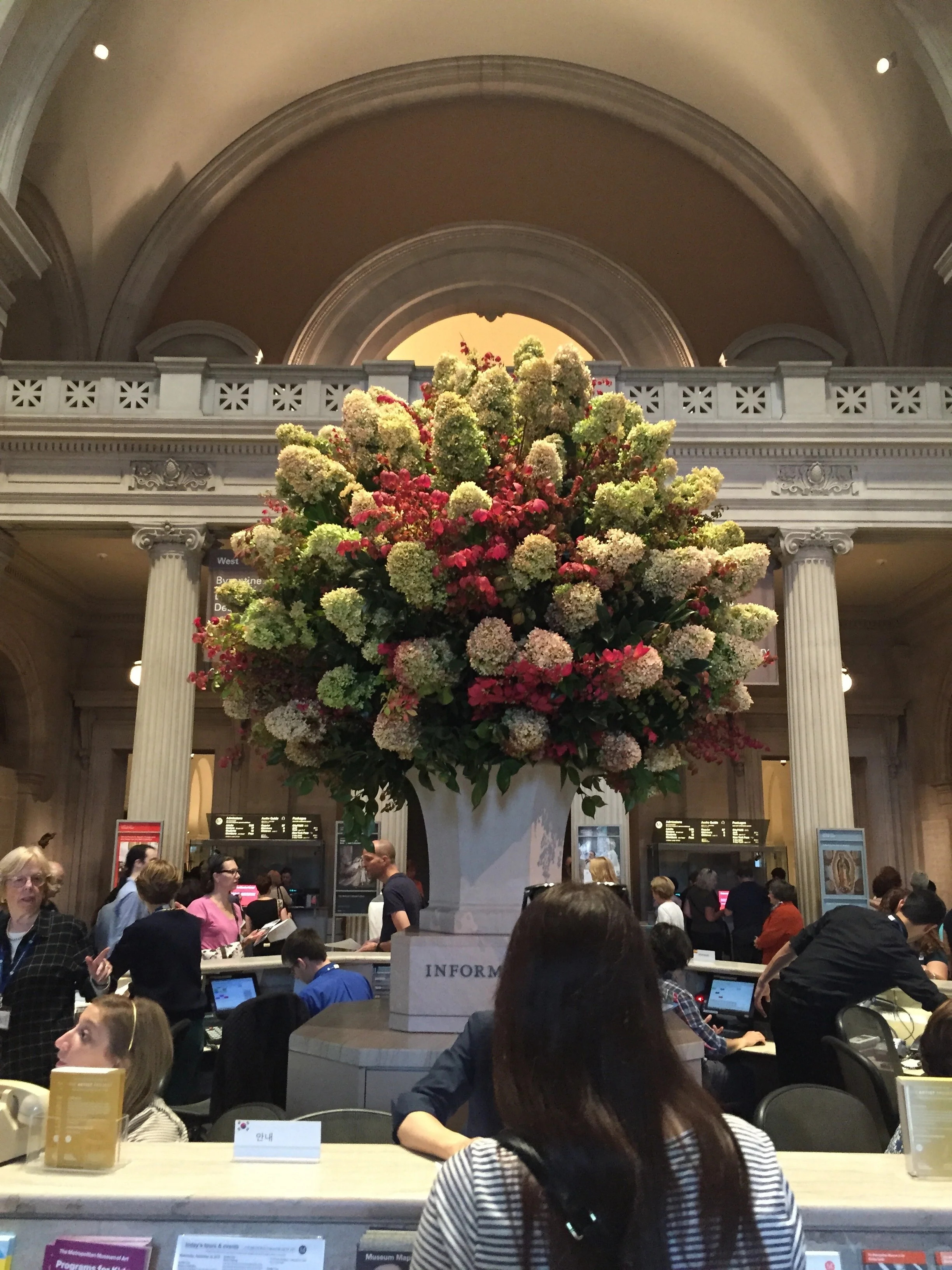
The early generations of museums tended towards powerfully articulated entrances. Often products of 19th century philanthropy, scholarship and largesse, they pronounced their civilising mission with great confidence and clarity. The museum itself was often the expression of a "grand narrative" (further expressed by the collection displays inside) and the architectural language, both externally and internally, is rich with references to the classical, sacred or natural worlds. The Museum of Fine Arts in Boston (above), the Harvard Arts Museum (below) and of course The Met (top) in New York all present a clear and strong face which frames an almost ceremonial transition for the visitor crossing the threshold.
Personally, I love this ceremonial procession. It fills me with a great sense of anticipation, a feeling that I am about to enter another world. But that’s probably because I’ve always adored theatre and I experience many museums as a form of civic scenography and collective storytelling. However, I am conscious that my feelings are not shared by everyone and I understand that plenty more people feel intimidated by the grand narratives explicit in these monumental entrances. They feel excluded, they have a sense that this other world is not welcoming to them and don't believe it could give access to anything relevant to their lives.
The question of ‘relevance’ is absolutely critical to museums today. It is part of a major shift from 19th century singular certainties to 21st century multiplicity. It is part of the acknowledgement that the ‘Grand Narratives’ of the 19th century were not telling the whole truth; that so-called ‘truth’ is always multi-layered and must have multiple voices to be expressed. In museums this has manifested in major efforts to democratise access to art and culture, to attract bigger and more diverse audiences and to engage those audiences in more direct and more personal ways.
This of course adds up to major increases in visitor numbers and the hard truth that visitor facilities in many existing museums are simply inadequate. As a result, many are remodeling their 19th century-style entrances while most new museums are designed around a welcoming and convivial entrance space, unmediated by symbolism and narrative. Equal access to ideas relies on getting people over the threshold and so museums the world over are seeking to dissolve what Elaine Heuman Gurion calls “threshold fear” by creating less formal, multiple and more relaxed entry points.
During my Fellowship travels I observed a huge amount of resources being invested in not simply expanding the museum entry sequence but in actually reinventing the entire language. And given that architecture gave up on grand narratives some time ago, it’s hardly surprising that the current wave of building and rebuilding museums should harness the democratic voice of modernism and hi-tech (see previous post on Renzo Piano's reworking of the Harvard Art Museums).
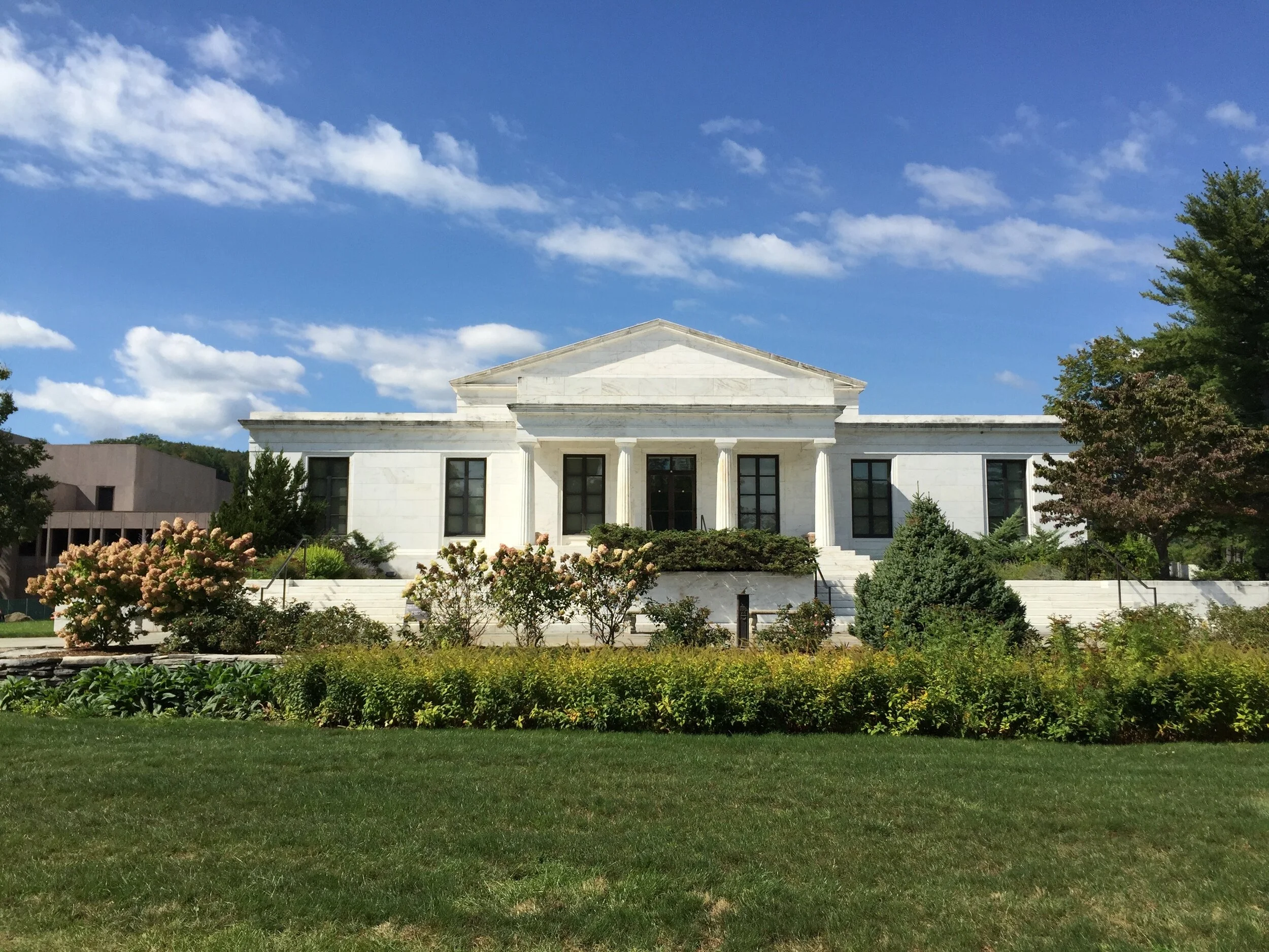
Original building of the Sterling Clark Institute, designed 1955 by Daniel Perry
The Clark in Williamstown, Massachusetts, is a superb example of this process. A neo-classical art gallery and research centre, the former ‘Sterling Clark Institute’ has been reinventing its language and multiplying its narratives for well over a decade.
Set in the hilly and forested landscapes of the Berkshires, The Clark was designed in 1955 by Daniel Perry for Sterling and Francine Clark to display their personal collection of European art (including works by Renoir, Monet, Degas,) and American paintings (including Sargent and Homer,) as well as sculpture, and decorative arts.
A second building was joined to the first in the 1970s in the brutalist style to house the growing research and study facilities. Since then the institute has continued to grow and has become an internationally important centre for research in art history and conservation as well as a strong focus for communities in the Berkshires who use The Clark for a whole range of activities and encounters throughout the year.
View of the Berkshire Hills from Tadao Ando's 2004 Stone Hill Centre
In 2004 The Clark engaged Japanese architect Tadao Ando to design a third building – the Stone Hill Centre, standing alone at the top of the site which introduces a new architectural language of planes, floor to ceiling glazed spans and the resultant embrace of the natural landscape.
Entrance to the rear of the Stone Hill Centre
Each axis in the Stone Hill Centre offers a glimpse of the landscape outside
This building, it turns out, was merely a rehearsal for an even more impressive show.
Ando’s most recent contribution, the 2014 Visitor Centre, has succeeded in entirely redefining the institution and the visitor experience.
In contrast to the classically symmetrical composition of the 1955 building, framed elegantly at the head of a sweeping lawn and highly visible from the main road, Ando’s low-lying addition has taken up a large, sunken footprint to the rear. Its concrete, ground-scraping form reveals itself slowly from the car park where the entrance route is drawn by a long granite wall leading to a pair of distinctly unceremonial glazed sliding doors.
An extended red granite wall draws visitors down a long line of procession from car park to entrance
The extended promenade along a granite wall is also processional, you could say it's a sequence not unlike climbing the steps on 5th Avenue to enter the Great Hall in the Met, but, significantly, the procession is flat, the threshold is not elevated and the doors are entirely transparent. (So much so, it was impossible to capture a photograph without total burnout.) Furthermore, the building is almost achingly devoid of meaning or reference. It is framing the experience for you but not defining it or prescribing it and, significantly in a rural art campus, the framing is designed to draw attention to the landscape, not to the collections.
Entrance doors give views to the landscape beyond
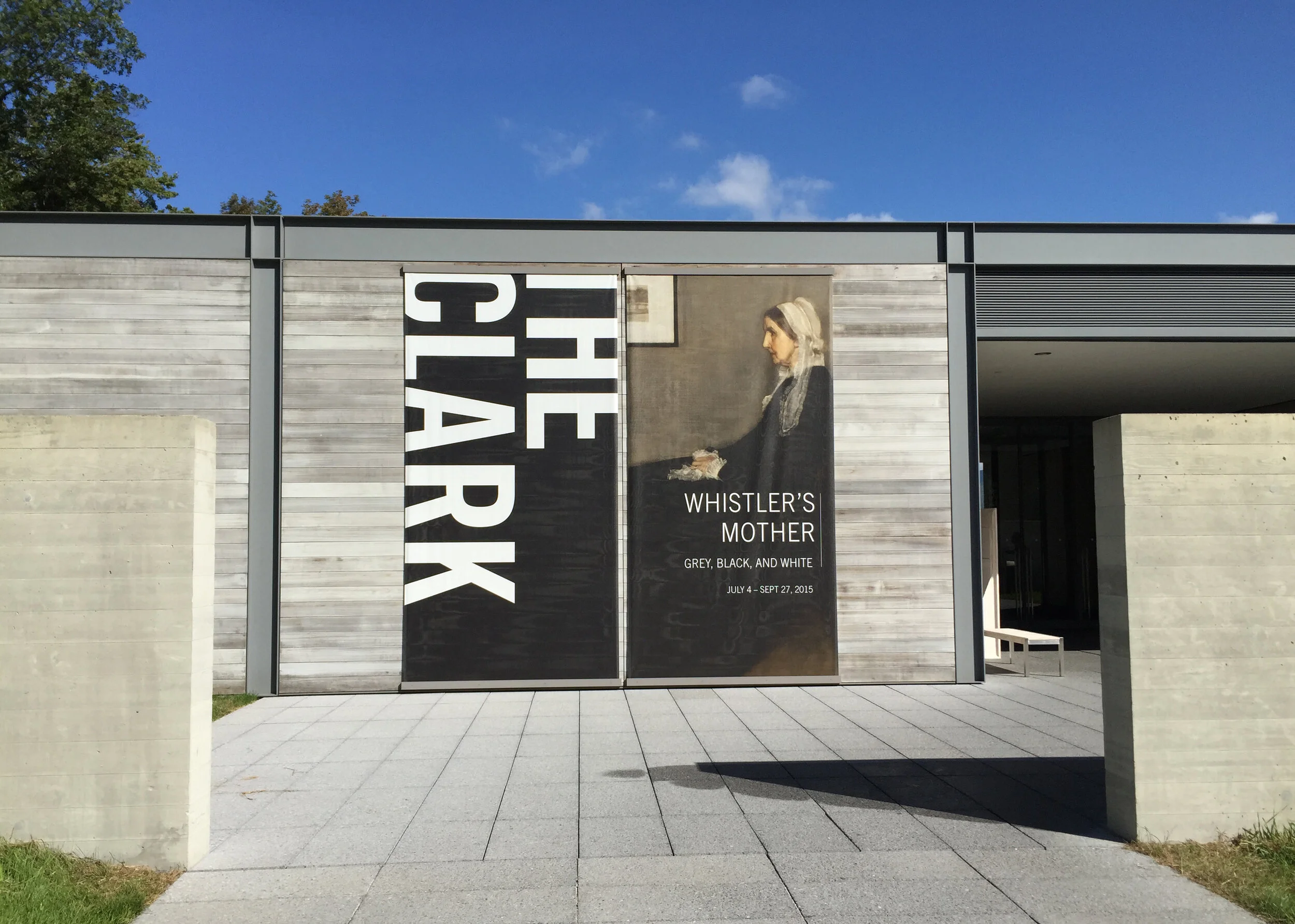
The neutral language of rectilinear and horizontal planes continues throughout the building. A beautifully designed welcome desk embodies the language of the evolved museum: the former Sterling Clark Institute now known simply as "The Clark"
After first allowing myself to absorb the gorgeously framed views of the Berkshire landscape, the controlled play of architectural line and the bold intersections of horizontal and rectilinear forms, I began to ask myself how else might Ando’s design language be communicating a different message from the 19th century museum aesthetic we are all so accustomed to.
The Japanese minimalist aesthetic inevitably draws comparisons with meditative sacred spaces and certainly the whole building feels deeply calm and quietly welcoming. But the interest here is how Ando has created a calm and simple building which nonetheless communicates great complexity.
The defining characteristic is most definitely the multiplicity of viewpoints from both within and without the building. Ostensibly simple in plan, the building comprises two concrete and glass pavilions connected by a long gallery – Ando describes it as “a swan with its wings spread.” But the experience of moving in and out and around the building feels much richer than this implies, and this because of Ando’s great skill in manipulating layers of form, of voids, of light, of shade and his skill in swallowing the landscape and drawing it into the simple, almost monastic interiors.
Ando’s summary of his approach is the perfect definition of the modern museum:
"In both the visitor centre and Stone Hill Centre, I have tried to express a deep respect for the landscape outside and an equal reverence for the art inside. It is critical that the art speak for itself and that viewers experience it in their own way." (my emphasis)
In other words, at The Clark Ando is expressing a new language of museums which has let go of any grand narrative and whose forms invite a panoply of narratives. It is a language of multiple contexts and stories: natural, urban, social, economic and architectural. It also happens to be stunningly beautiful.
View of the reflecting pools from the Visitor Centre Terrace


